Woodland Drops
PASSION PROJECT
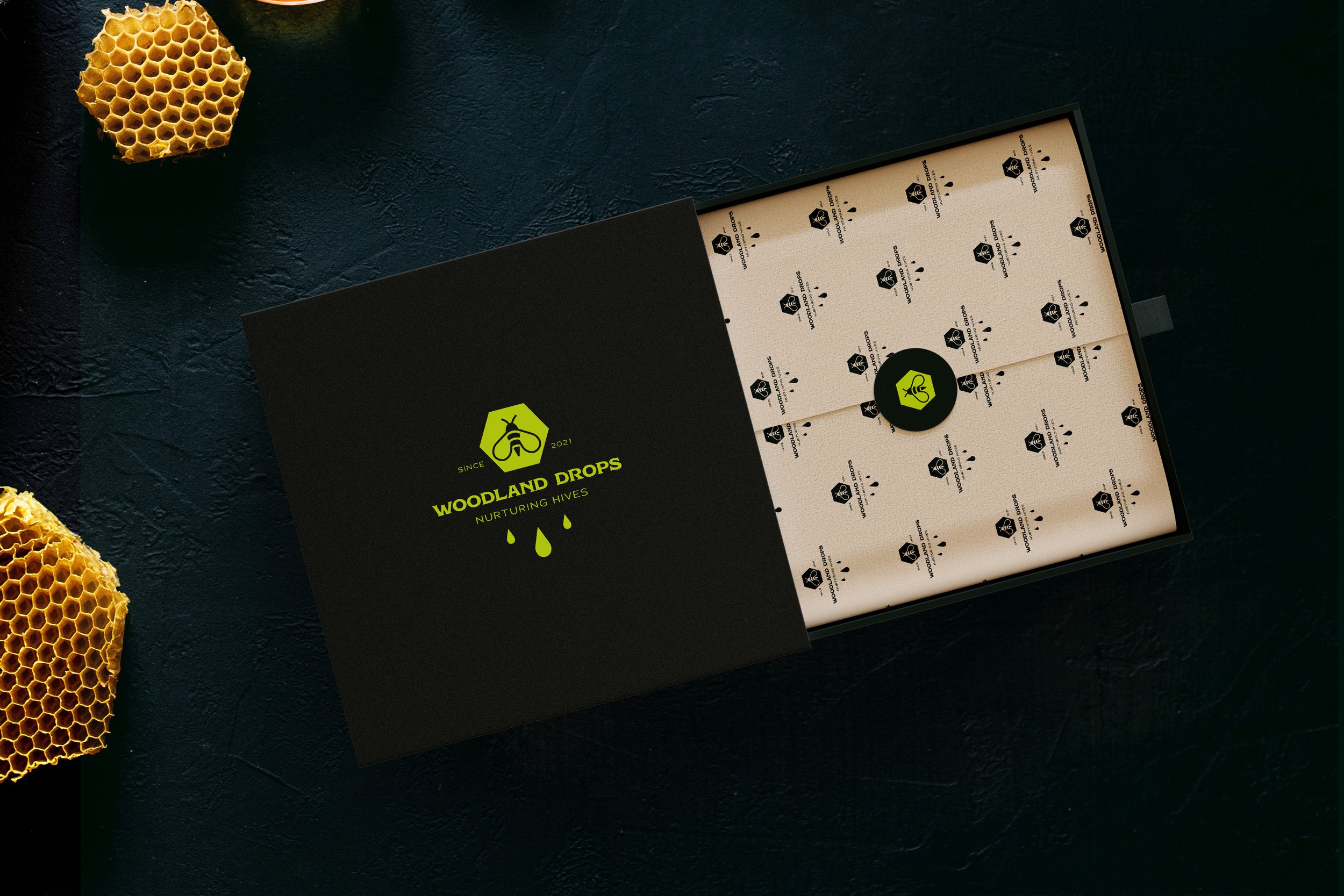
Creative direction, logo set, colour palette, label design, brand pattern, business card.
YEAR: 2023
ABOUT THE BRAND
Woodland Drops is an exquisite brand dedicated to providing premium, pure organic honey that is guaranteed GMO-free. With a commitment to excellence and a passion for nature's bounty, Woodland Drops stands as a beacon of quality in the world of honey production.
At Woodlands Drops, they go beyond traditional beekeeping. They nurture their hives with care, ensuring their bees thrive in their natural habitat, resulting in honey that exudes richness and depth of flavour.
VISUAL IDENTITY
While embracing luxury, Woodland Drops dares to defy convention by departing from the typical colour palette associated with premium honey brands. Opting for vibrant and daring hues, their product packaging demands attention on every shelf. The primary brand colours, a lively pear and a deep black-green infuse a fresh vitality into the brand's visual language. Complementing these mainstays, I incorporated supporting shades: a gentle mauve, an inviting rose bonbon, and a tranquil turquoise, adding depth and intrigue to the overall aesthetic.
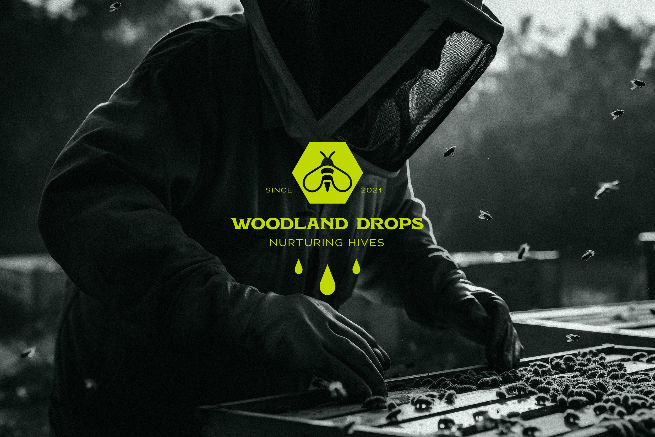
Woodland Drops logo design exudes a timeless sophistication, featuring a stylized bee within a honeycomb, adorned with delicate honey drops. This emblem encapsulates the essence of Woodland Drops - a fusion of nature's bounty and refined craftsmanship. To further elevate the brand's identity, I employed a harmonious blend of a contemporary hand-drawn typeface and the distinguished Adrianna extended typeface for the logo's typography. This fusion imparts a balance of modernity and elegance, reinforcing Woodland Drops as a brand of distinctive luxury.


Position your brand for lasting success!
Get in touch and let's kickstart your brand transformation!
Click HERE to inquire

